A friend/colleague wrote a thing: https://medium.com/@mokounkova/color-in-online-art-images-becc9ee517d4 about colour variability in digitized art.
I thought it was super cool and wanted to give it a go in my weapon of choice Mathematica. But I got distracted, because Mathematica.
I thought it was super cool and wanted to give it a go in my weapon of choice Mathematica. But I got distracted, because Mathematica.
I started with one of my favourite paintings, "The visit of the Queen of Sheba to King Solomon", by Sir Edward John Poynter, in 1890. I am very late romantic, afterall. High resolution version here: http://tinyurl.com/oj7tfhn
Low resolution version here:
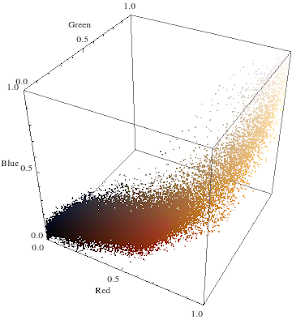
Each pixel has an RGB value which can be translated into a position in 3D space. Here is a very schmick diagram of the same image, with the points coloured appropriately.
What we see here is that the palette is overwhelmingly red, red, red, and mostly in the middle area.
Clearly my taste in art needs work, so I took Masha's promised (but not delivered) example, Botticelli's "Primavera" 1482, oh so early Renaissance.
In 3D colourspace, it looks like
Clearly Botticelli would have executed his art in such a style, if only he had the tools. What's cool about this is there seems to be some structure. The diagonal axis corresponds to the admixture of white or black paint to lighten or darken the original colour, and as such we see a number of diagonal spears of colour. From this angle the red central garment and blue of the sky are most prominent.
Being a physicist, I ripped out the dimension of brightness as soon as humanly possible.
Being a physicist, I ripped out the dimension of brightness as soon as humanly possible.
Here we see some broad colours varying only in hue, completely saturated. Let's rip out that dimension properly...
For some bizarre reason Mathematica requires 2D ListPlots to be joined if they are to be coloured, so we have lines of scribble. As before, the dominant colours are reds and purples, with a few greens thrown in. The blacks and darker colours are most likely hovering around the middle somewhere.
Regarding the original question of colour differences between different digitizations of art, I speculate that principle component analysis should be able to reproduce the wide variety of images found on the internet.
Regarding the original question of colour differences between different digitizations of art, I speculate that principle component analysis should be able to reproduce the wide variety of images found on the internet.


No comments:
Post a Comment
If you want to comment without a google or open-ID account, sign enough of your name that at least I know who you are, or leave an email address or bank account details or something.
Note: Only a member of this blog may post a comment.